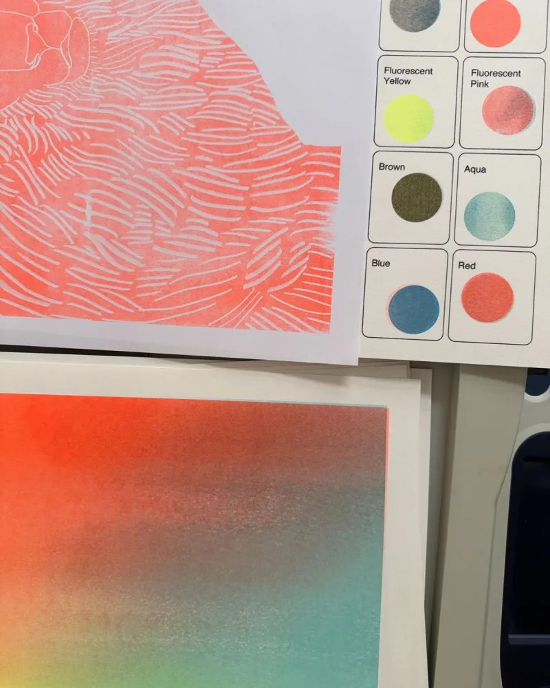
How I test what the inks do over each other
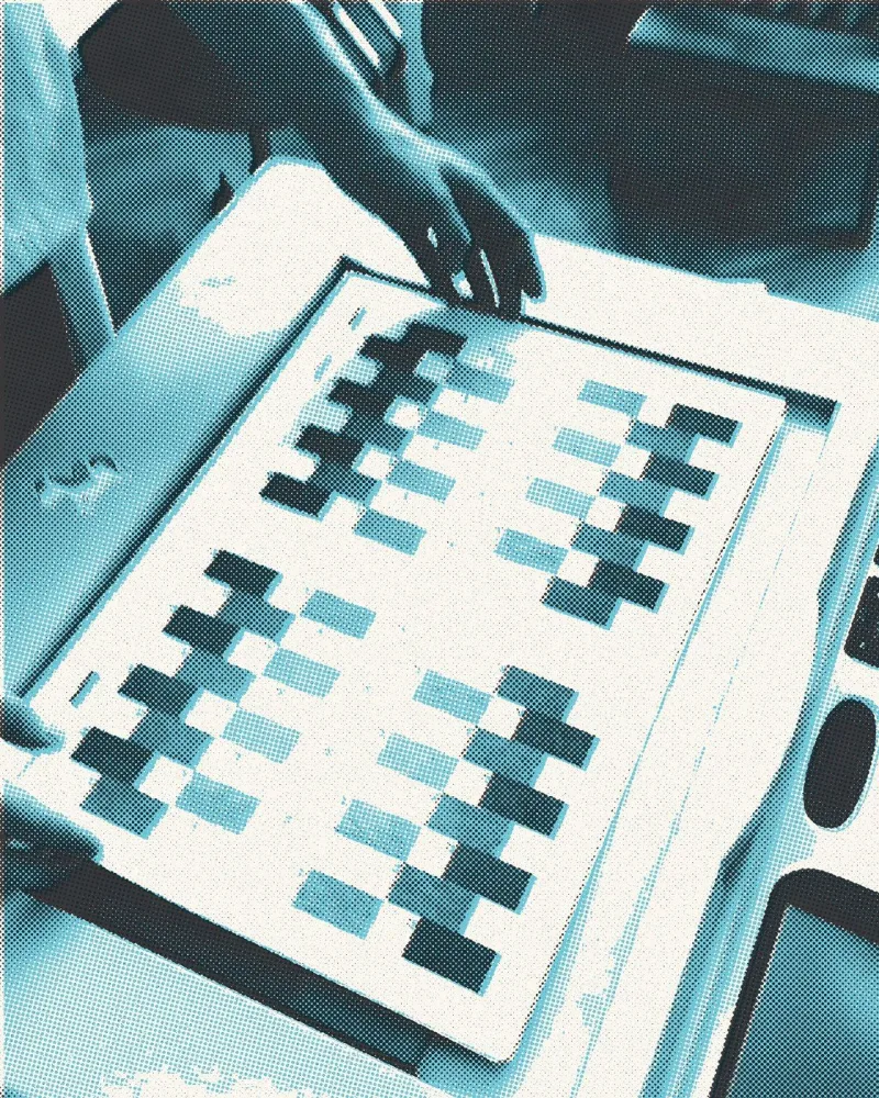
Riso inks are translucent. When I print one over another, it does not cover it, it makes a third colour. Which one exactly, you cannot tell from the screen.
That is why I print colour charts.
Little rectangles in every combination
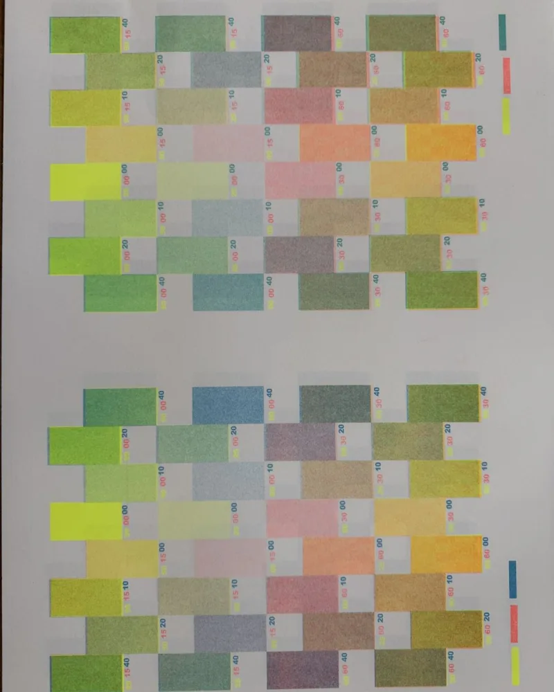
I lay out rectangles in a few densities on a sheet and print them one after another in all the inks I want to combine. Each one gets a tiny label, so later I know what I am looking at.
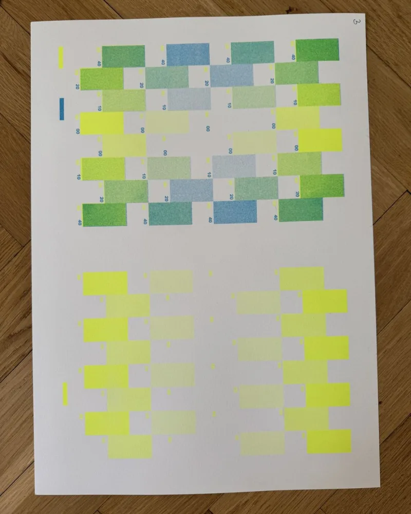
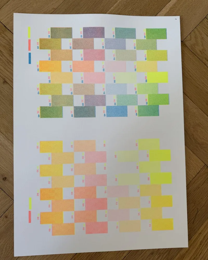
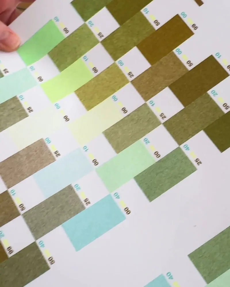
From the finished charts I pick the inks for a new poster. Fluorescent yellow over aqua gives a bright green, mint over gold an olive, aqua over fluorescent orange a warm brown.
Order and density matter too: the same two inks look different when one of them is only a light screen.
Gradients
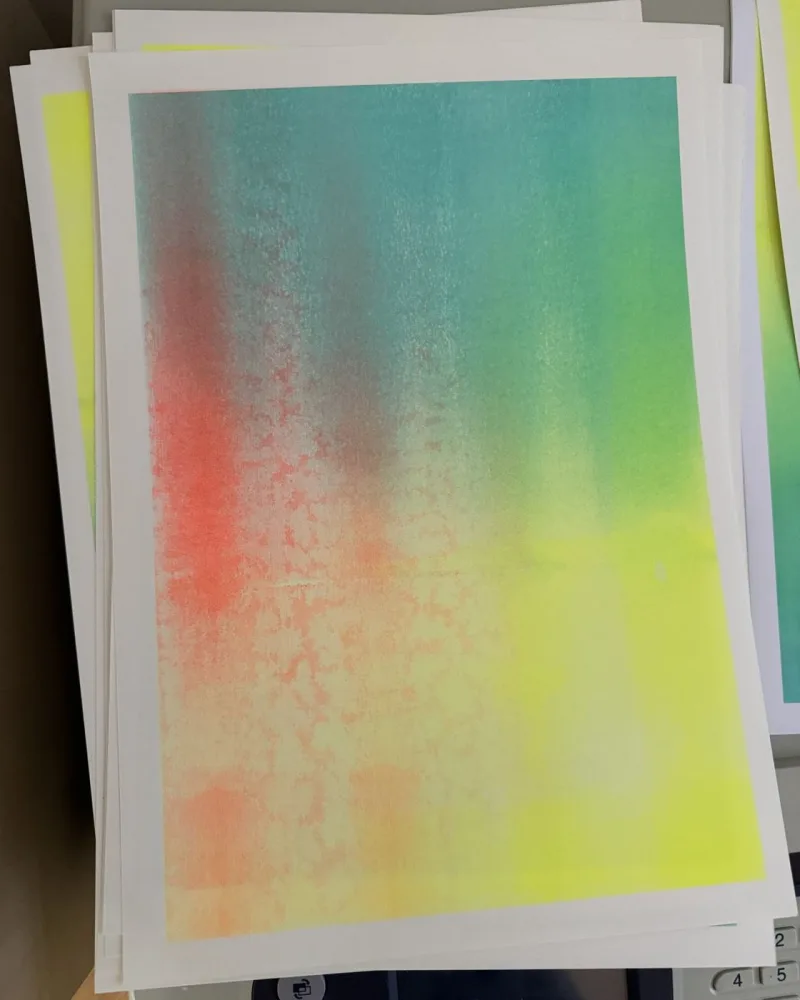
Besides rectangles I also try gradients from one ink into another. They show best how fluorescent inks behave as there is more and less of them.